Just heard that 3 pieces of my work have been selected by the judges for the thirteenth annual 3x3 International Illustration Show. For more info look here.
Just heard that 3 pieces of my work have been selected by the judges for the thirteenth annual 3x3 International Illustration Show. For more info look here.

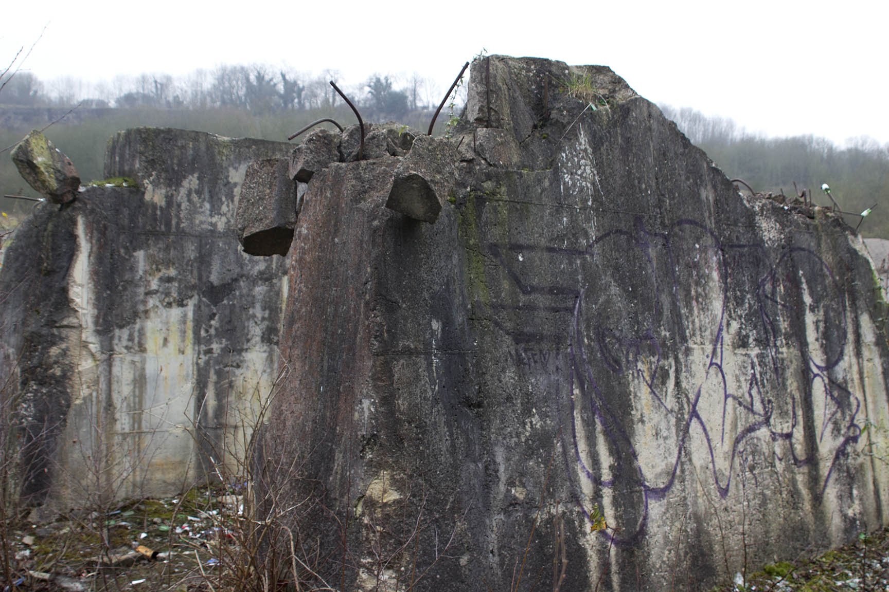
doorJPG
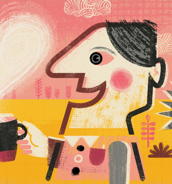
Having a studio at home is great in lots of ways; no commute, it's cheap, and warm. But the downside is the distractions, some self-imposed.... I'll just make a cup of coffee before I start that...... and after 3:00 or at weekends....... Dad can I borrow a pencil sharpener, sharpie, elastic band, stapler, paintbrush etc etc, this is my attempt to find an hour to myself at the weekends.
Today though I might just pretend to be working and read the new World Of Interiors Magazine all day, can't afford anything in it, but always it a great source of inspiration. But first that cup of coffee........
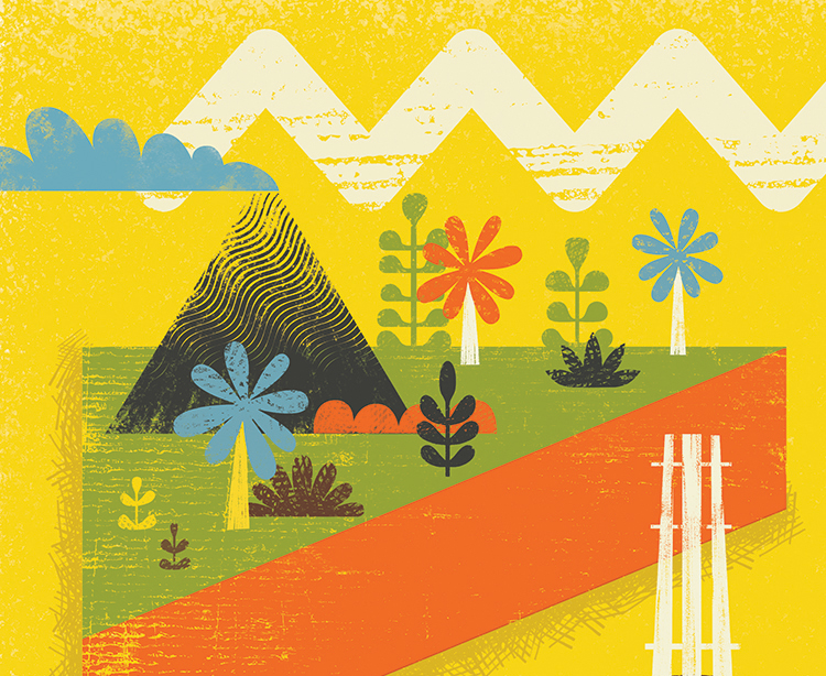
One finished piece and a rough plan for a new image. I've always had a thing for mid century ceramics so thought I would indulge my 'vase fetish' with a series of images, first one will feature beautiful vases, dead plants and insects. I think it may be a homage to those dead insects I always used to see as a kid in shop window displays in the 1960s and 70s. Retail has move on a little since then ;-)

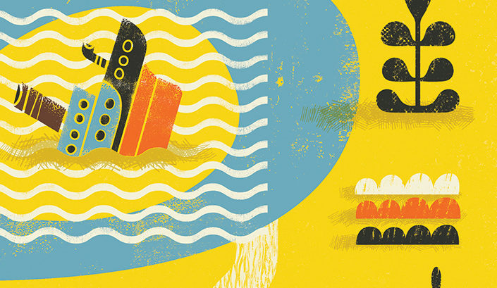
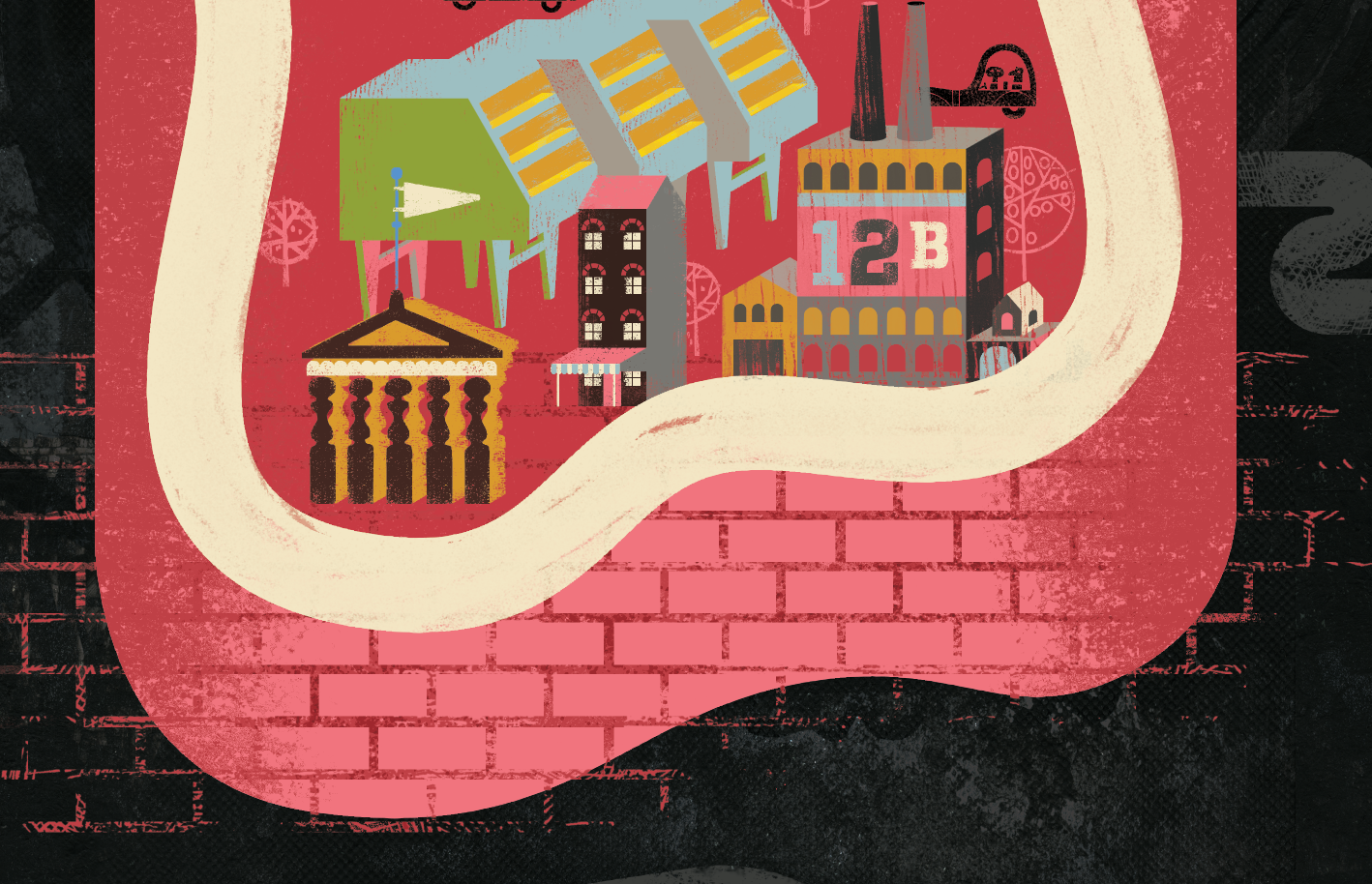
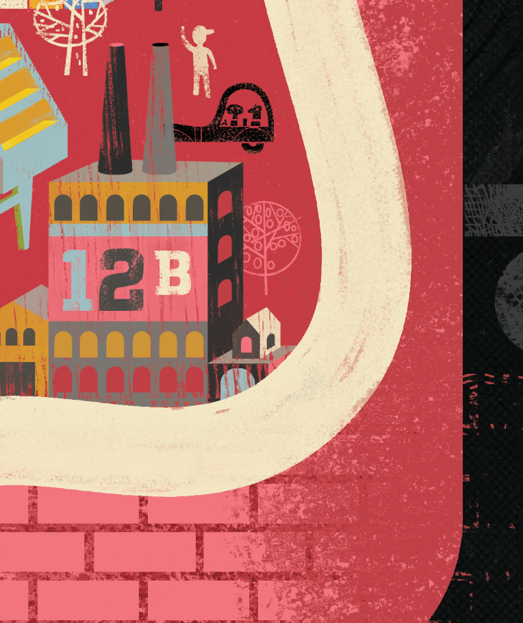
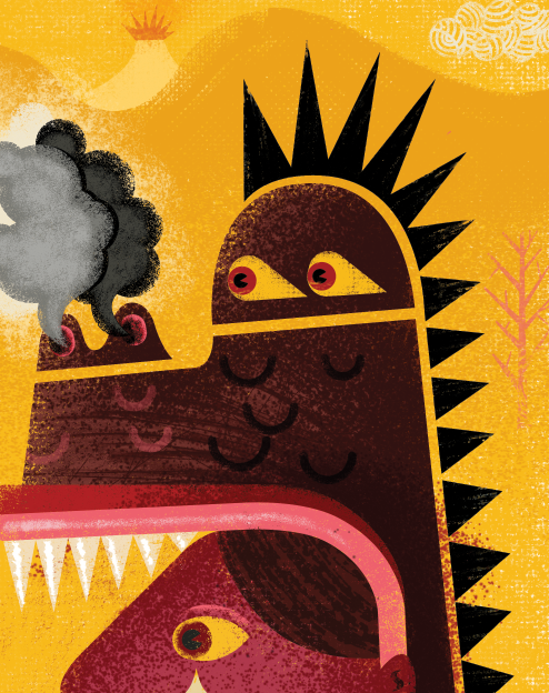
A visual response to the migrant crisis. Many countries in Europe, including our own, are largely ignoring the crisis and getting on with their lives as normal, making pictures for a living can seem trite and ineffectual, especially whilst people struggle to relocate their lives, often dying in the process. I have put this image on my shop as a print, all profits will go to www.redcross.org.uk/refugeecrisis "......One drop in a limitless ocean. Yet what is an ocean, but a multitude of drops?"
David Mitchell, Cloud Atlas
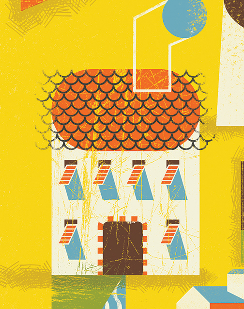
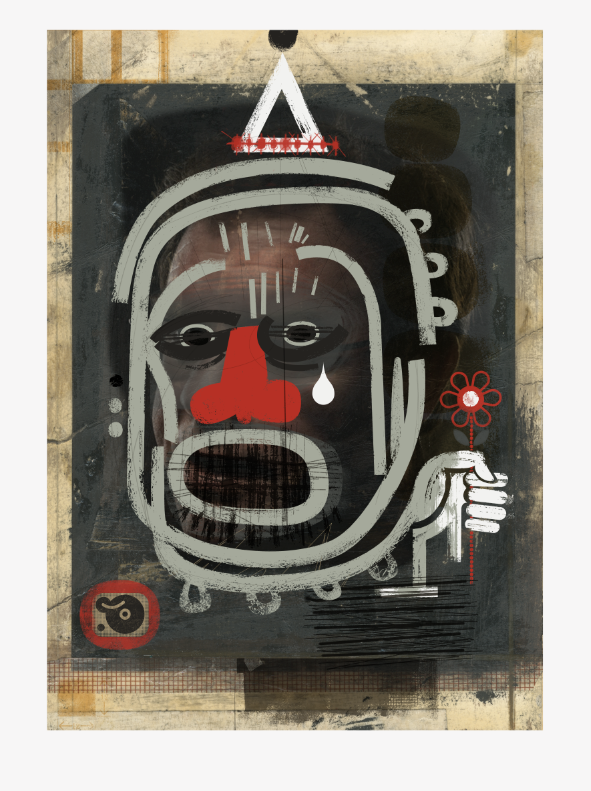
Finally finished this new piece, would like to do a series of these time permitting.

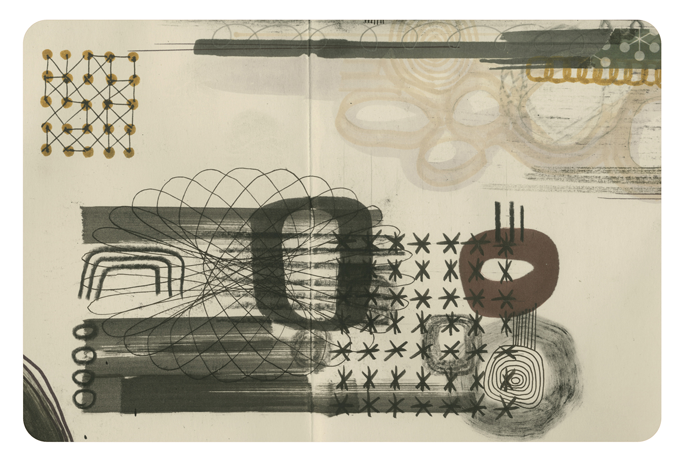
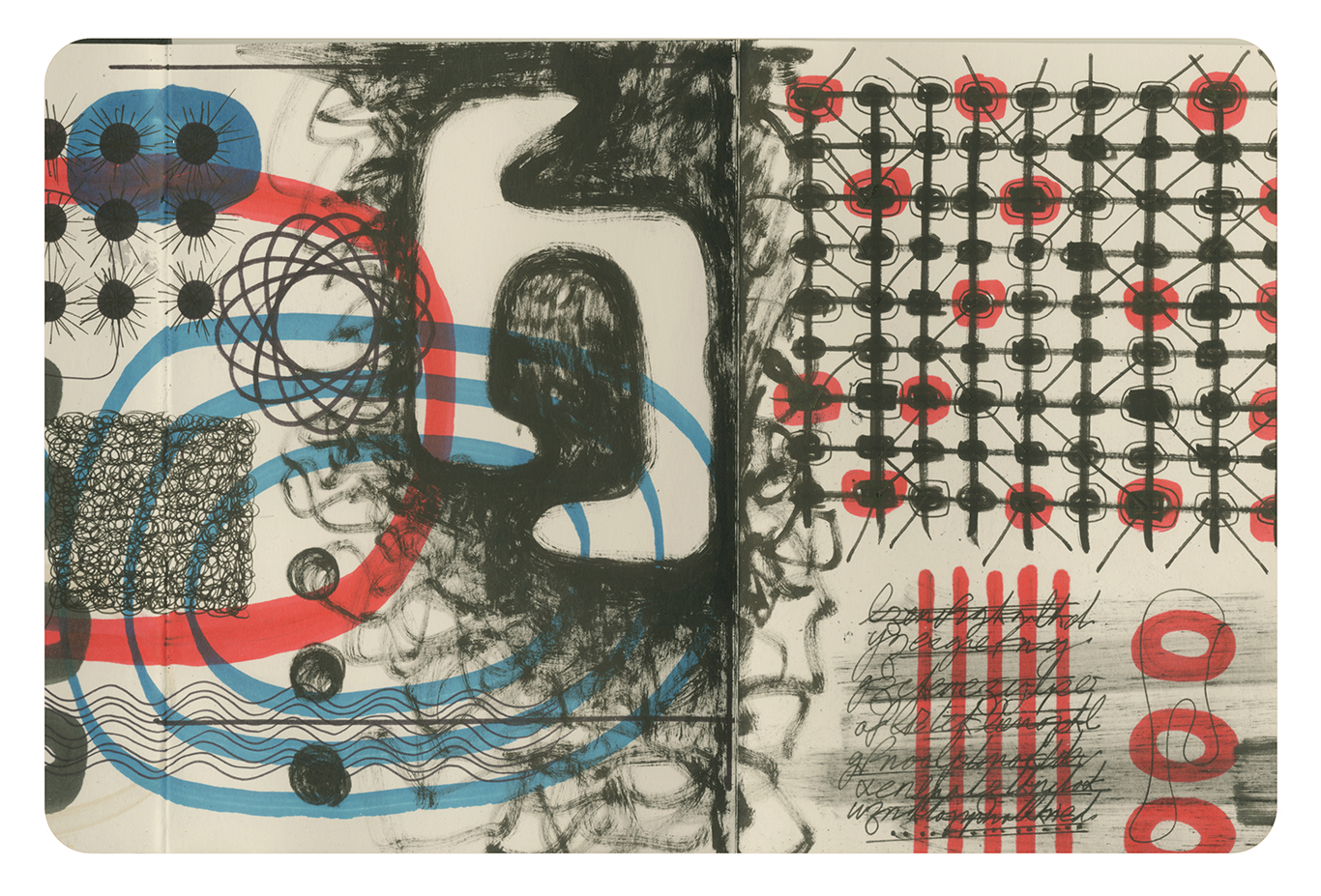
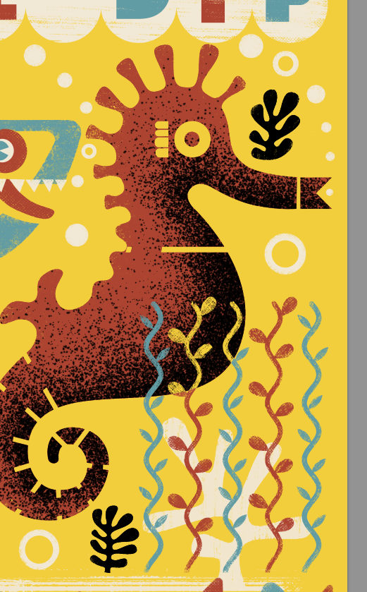
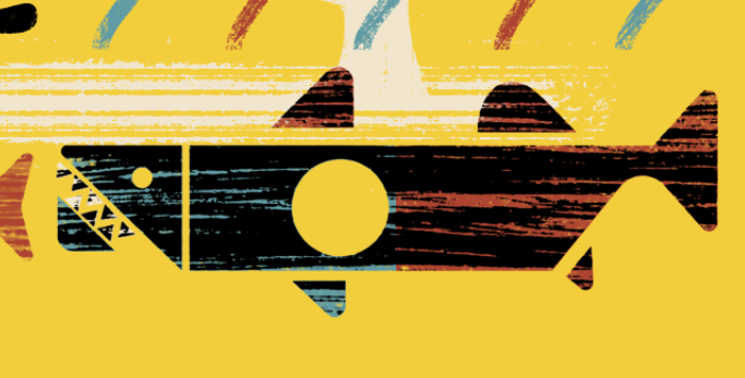
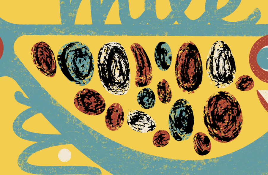
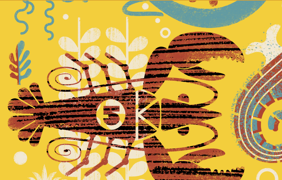
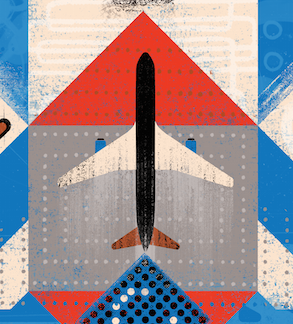
3X3 1
Pleased to say that I have some work in the forth coming 3 x 3 International Illustration Professional Show No.12. Two Merits and an Honourable Mention.

3X3 4

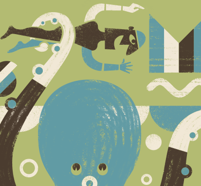
3X3 2
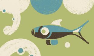
3X3 3
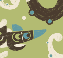
3X3 5
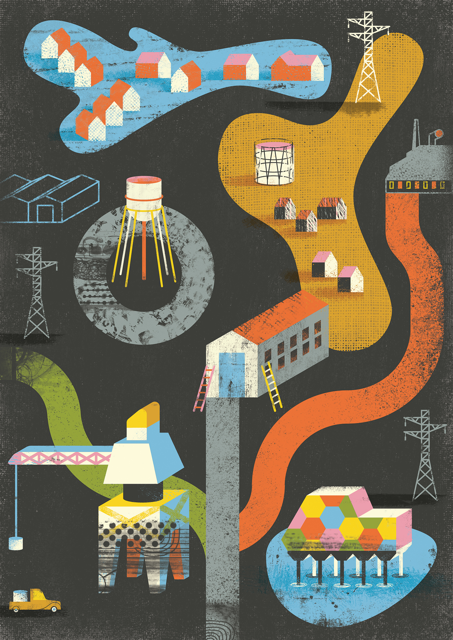
Cropped detail images from work for a recent American client, working with the theme of knowing yourself. More later when they're published ;-)
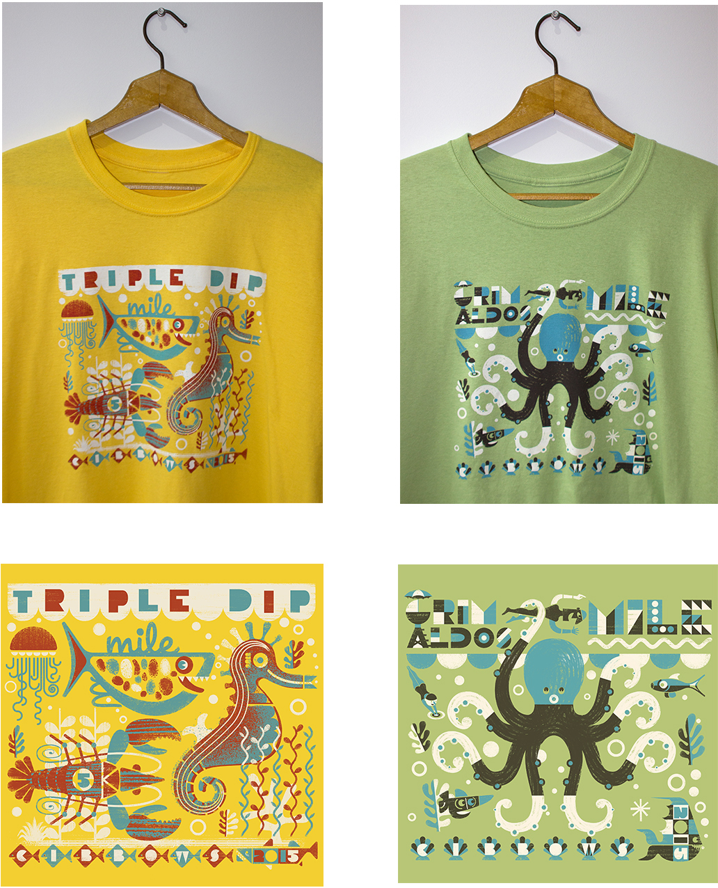
Some sneak peeks of recent tee shirt designs for CIBBOWS Coney Island Brighton Beach Open Water Swimmers NYC. A shirt design for each of the two main races at the event. Really nice job to work on. Thanks to Patricia Sener at CIBBOWS for the great Art Direction.
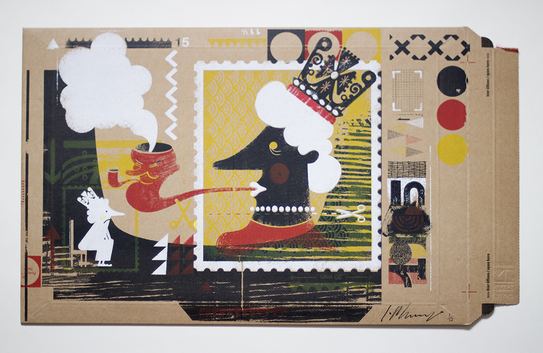
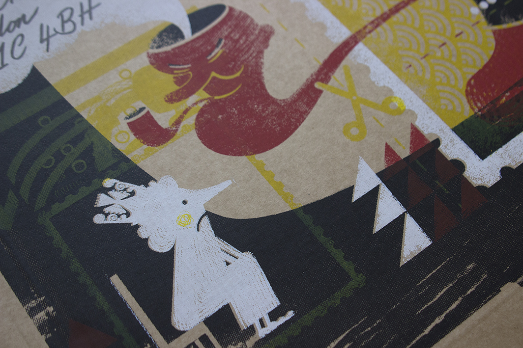
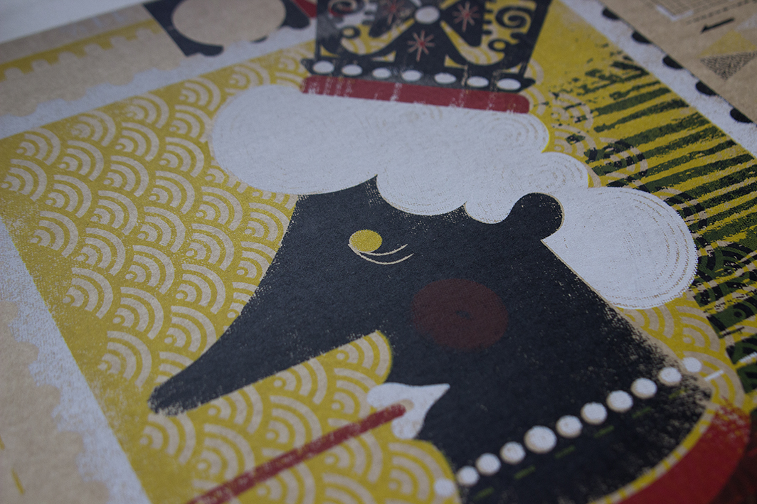

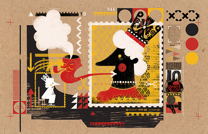
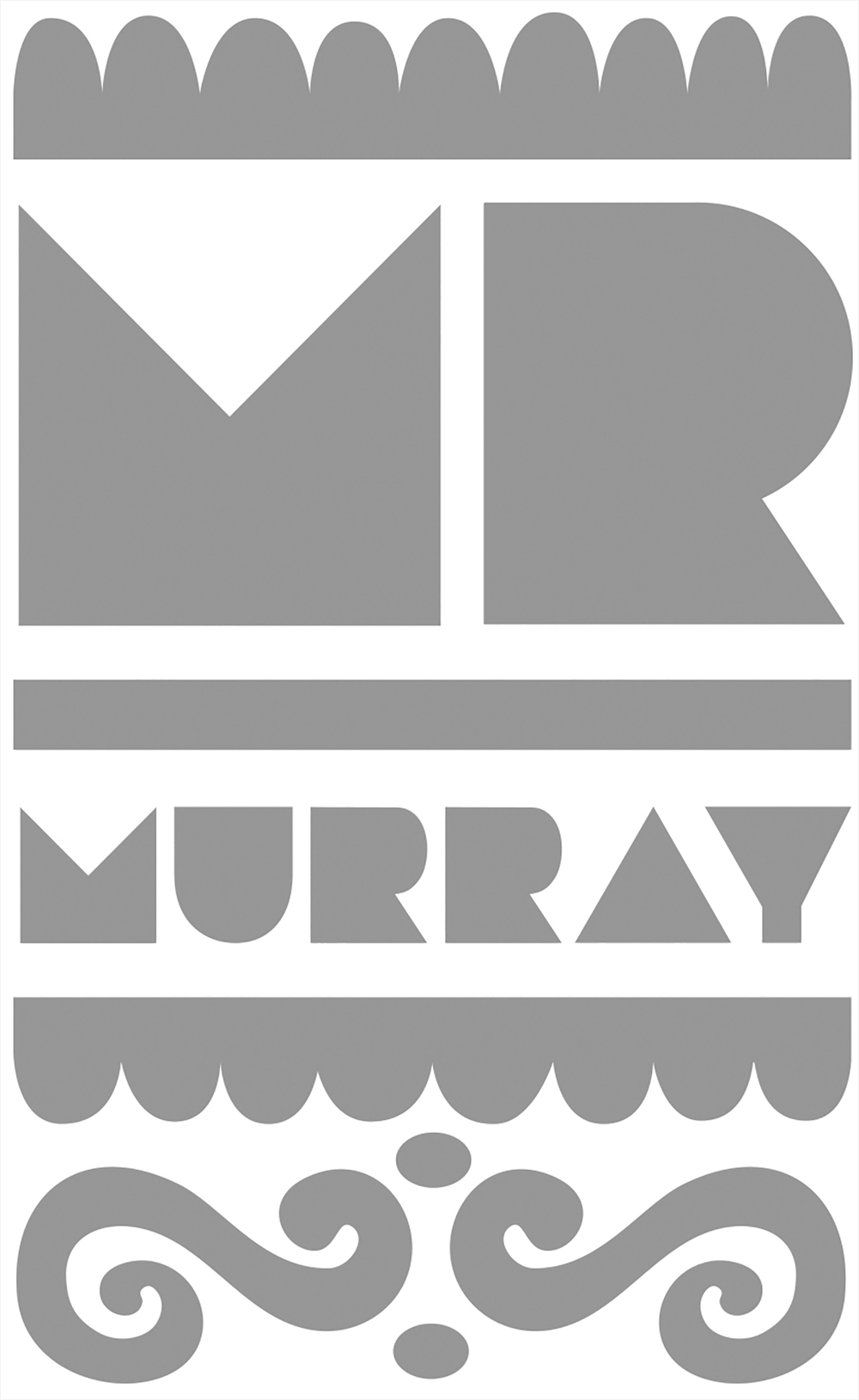
When researching the history of the postage stamp to produce an image for this exhibition, I was thrilled to discover these small personal connections which stirred such strong memories, and for me at least inform the story behind the stamp. This image (for what it’s worth) is for those 3 principled men Tony Benn, David Gentleman and Albert Murray who have all informed, inspired and enriched me.
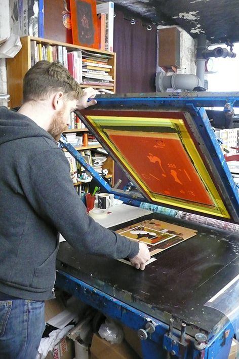
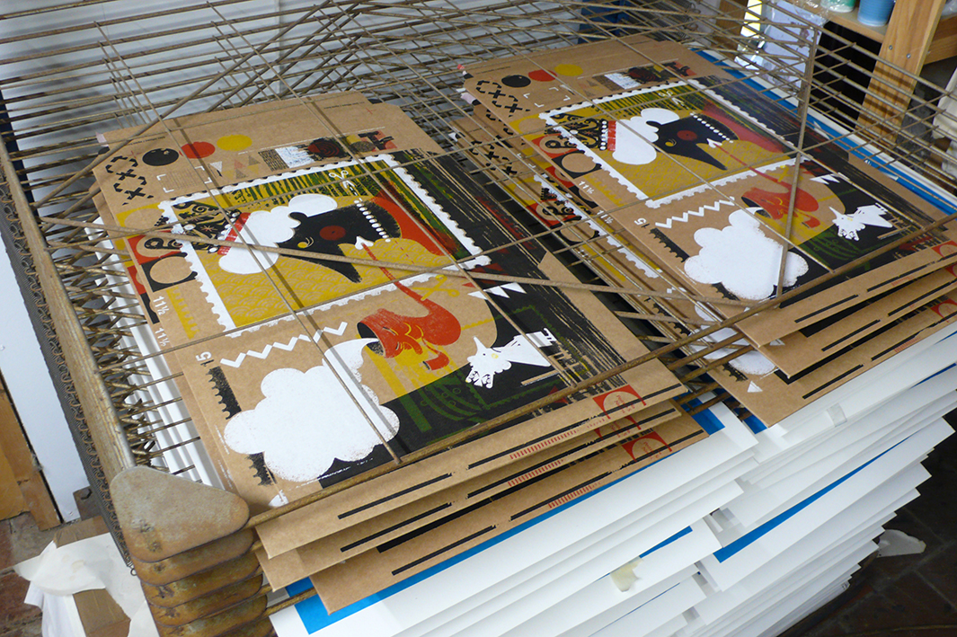
Preparing prints for the forth coming ‘Pushing The Envelope’ exhibition, celebrating the 175 th anniversary of the postage stamp, held at House of Illustration -London from May 6th onwards. Massive thanks to artist / illustrator and master print maker John Powell Jones who helped me print the limited edition, 4 colour images on to brown card envelopes.
Since uploading to my website the response to a brief set by design legend Vaughan Oliver at the wonderful Stockport College . I've had a quite few inquiries about getting hold of copies of the image. Here with the big mans kind approval, should you be interested, you can do so.
Just finished a fun but technically challenging job for a client in London. The art of writing an inspiring, succinct brief and subtle but effective art direction is not dead I'm please to report.
On a recent trip to Tameside College saw this in a studio. Some of mine are much worse than this, guilty as charged.
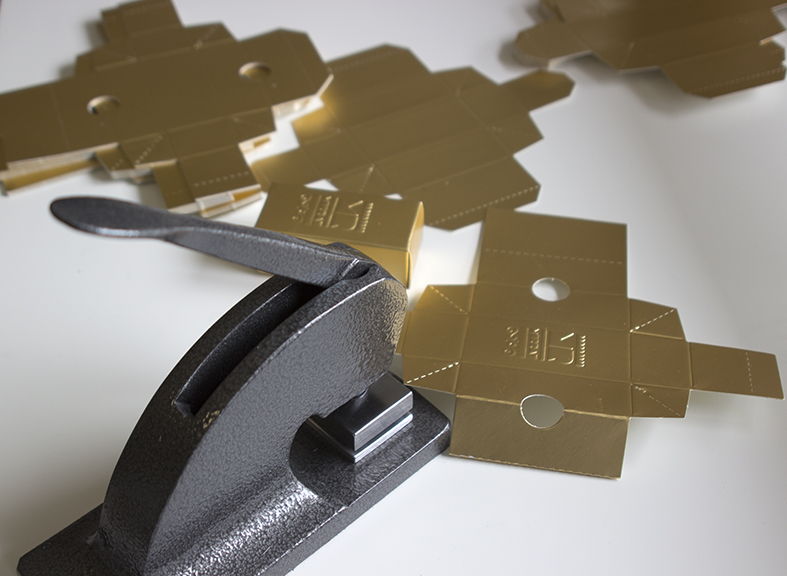
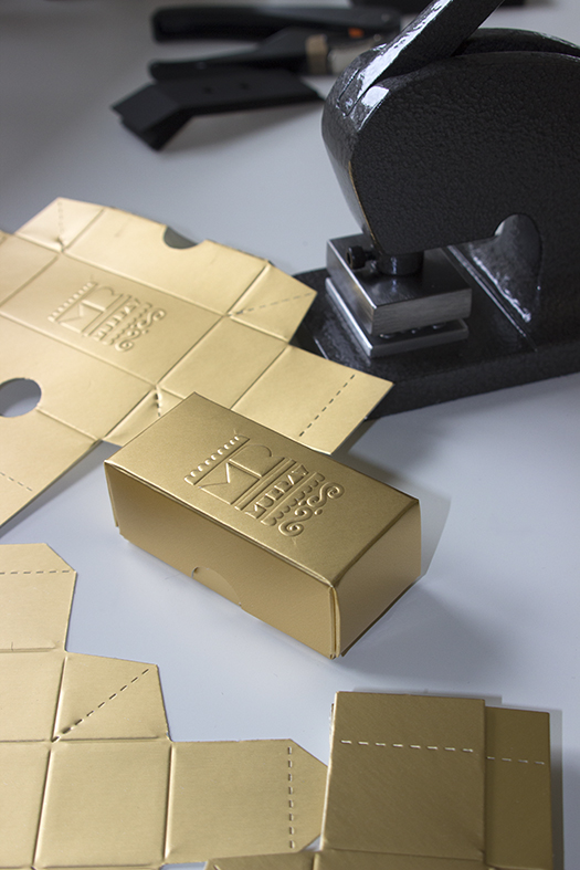
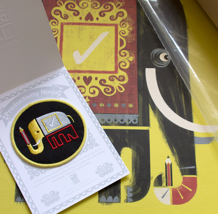
Trying a new toy out in the studio today, a cast iron Notary Press, which I've fitted my logo onto. What next.....maybe I'll start wearing a signet ring over a velvet glove like Alan Rickman in the Sheriff Of Nottingham.